Rethinking Data Acquisition for Data Visualizations
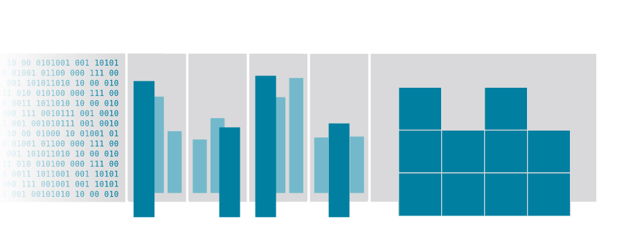
From raw records to bar charts to space-filling pixels — the cover of the dissertation.
Rethinking Data Acquisition for Data Visualizations · Dr.-Ing. Thesis, TU Berlin
Uwe Jugel
The System Under Study
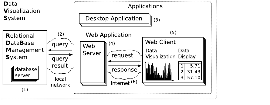
From Database Server to Browser Pixel
A data visualization system: RDBMS, web server, and web client — every arrow is bandwidth, every component adds latency.
Five properties limit how fast a chart appears: query execution, two network hops, post-processing, and rendering. Lower data volume improves all five.
The Core Idea
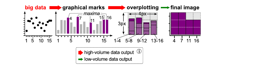
Overplotting Is Implicit Data Reduction
Big data is projected to graphical marks; marks overplot each other; the final image keeps only the dominant ones.
When thousands of records land on the same pixels, the renderer silently discards most of them. VDDA computes exactly the surviving records — inside the database, before the data ever travels.
From M4 to Every Chart
The Line-Chart Result Generalizes
4extremum tuples per pixel column give error-free line charts (M4, VLDB 2014)
1dominant record per display unit suffices for most other chart types
SQLevery operator is plain relational algebra — no engine changes
A display unit is the pixel, pixel column, bar, or grid cell of a chart. Each one can only show a bounded number of records — the rest is overplotted.
One Model, All Charts
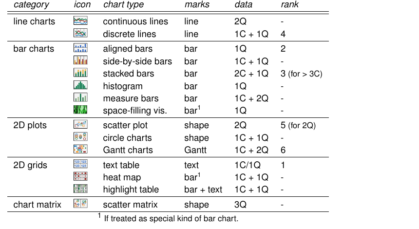
The Considered Chart Types
Mackinlay's chart-type collection, extended with space-filling visualizations — the reference list VDDA covers.
The VDDA Query Model
Correlated Maximum Aggregation
For each chart type, a correlated maximum aggregation selects the records that dominate each display unit:
-- aggregation: last timestamp & highest value per group --
WITH A_max AS (SELECT k, max(t) t_max, max(v) v_max
               FROM Q_g GROUP BY k)
-- correlation: fetch the matching raw records --
SELECT id,t,v FROM Q_g JOIN A_max
ON  Q_g.k = A_max.k
AND (t_max = t OR v_max = v)
The original query is enclosed, never modified — the rewrite is fully transparent to the visualization client.
Performance
Faster Before the Data Even Leaves
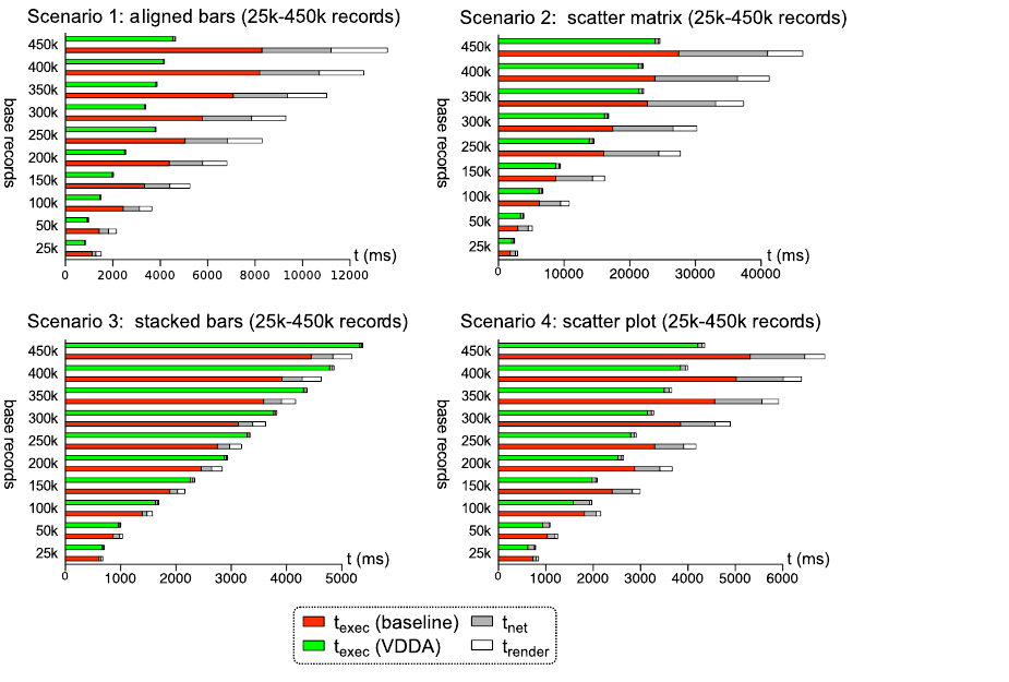
Four scenarios, 25k–450k records: VDDA query execution (green) vs. baseline (red), plus network and rendering time.
Results
Pixel-Identical, Orders of Magnitude Smaller
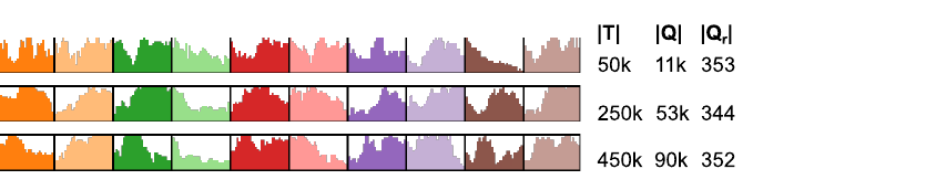
Scenario 1 — ten series of aligned bars: 450k base records, 90k selected by the original query, 352 by VDDA.Scenario 2 — four series in one scatter plot: 450k records reduced to 2,540, same image.
The Takeaway
Let the Chart Tell the Database What It Can Show
1:254best measured data reduction ratio (average 1:43)
3×faster total time to chart, up to — never slower than the baseline
0pixel errors across all evaluated chart types and scenarios
Published as M4 (PVLDB 2014, among the best papers of VLDB) and VDDA (The VLDB Journal, 2016) — both on the shelf of this library.